

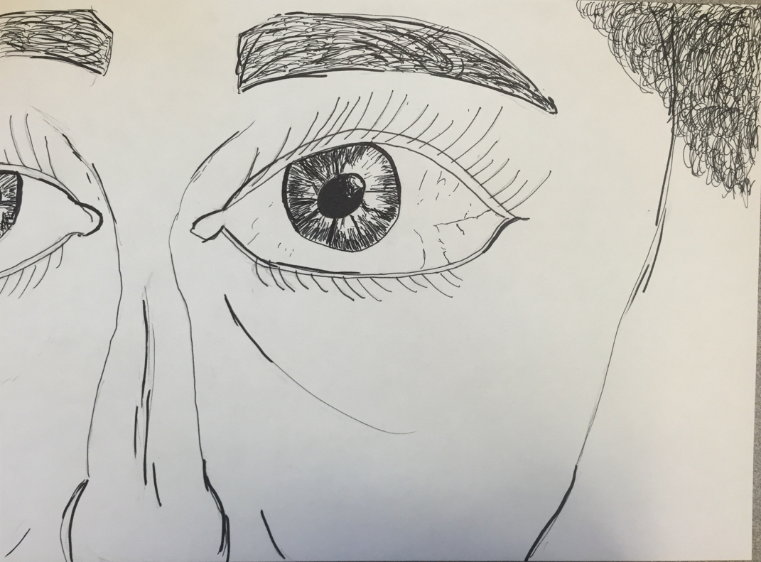
 If I would of not had help with the demo that Ms. Sudkamp this drawing would have been very difficult. She made the drawing process very simple with just a couple of lines and a couple of circles. I wasn't sure how to make the colored part of the eyeball but I messed around with a couple of options and ended up going with the one above. I decided to go with a simple zoomed in look on a face of an older woman (ass you can see by her curly hair and wrinkle under the eye and near the nose). I found making the nose realistic difficult. 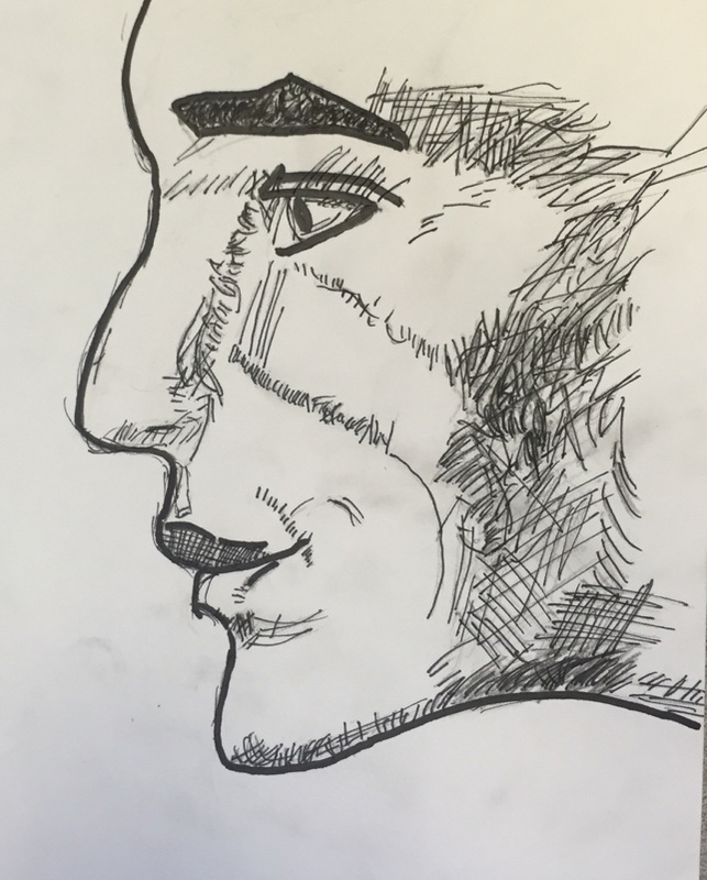 I was always fascinated at the art of drawing realistic objects using simply the techniques of hatching and cross-hatching. So I found picture of a side profile of a face. I used darker hatching and not as dark hatching. I used a thick sharpie and thin more detailed sharpie. I went in with the thick sharpie and drew the outline of the face. Then went in with the thin sharpie for the hatching to represent the shading. 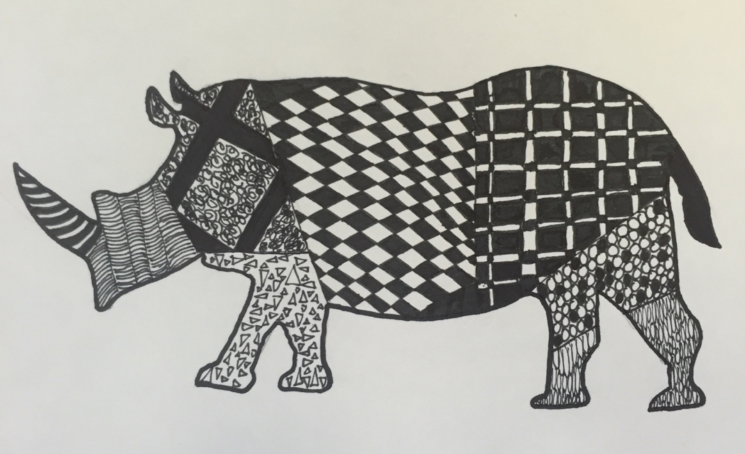 I am not going to lie I did not find this project very relaxing. I found it kind of stressful trying to figure out what pattern to draw and how to make it symmetrical on the section of the rhino. I believe that zen does match this. Also the hardest part of this project was the rear end of the animal with the black squares and thin white lines. I found it hard to make the white lines thin enough and straight enough.
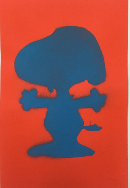 I like how the snoopy stencil I made was so simple but yet still detailed. I traced his outline using a projector and then used an exacto knife to cut along the line. The exacto knife was the hardest part of the whole process because you have to be very careful and attentive because one wrong cut could ruin your peice of art. I was going to leave peices of Snoopy on the stencil for spray painting (like his spots and eyes) but I decided that I just wanted an outline similar to a cookie cutter. Overall it was a great success and an interesting project. 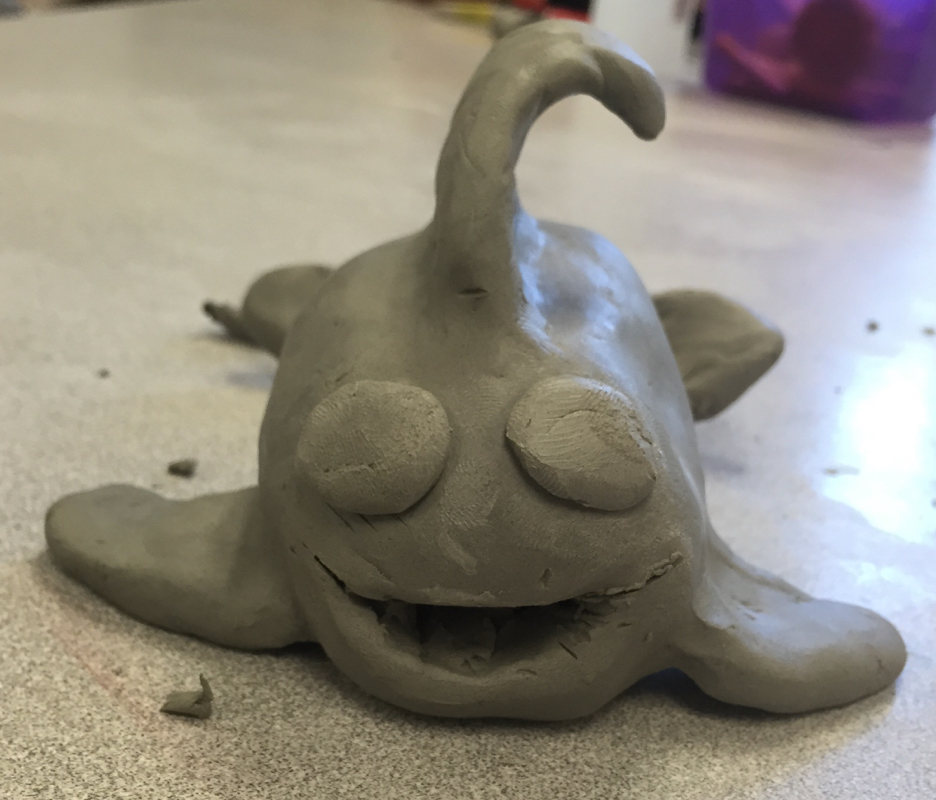 My second peice that I decided to pick was my clay fish (in this case it is a whale). The reason I decided to do a whale is because it was different from the demo and when I was younger I went to paint your pot and painted a whale that my mom still has today. So I made a whale and painted it blue with the same color glaze as I did back in the day. That hardest part of the process was getting the fins to stay in the spot I wanted them on the whale. Also another downside to clay is that the process takes a while, both crafting then the kiln then painting then the kiln again. Overall it was a great project. 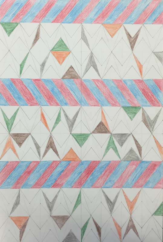 I was inspired by the triangle geometric shapes found here: https://www.hardtofind.com.au/57396_multicoloured-geometric-triangle-pattern-art-print The medium that I picked was pencil and colored pencil. I decided to keep it simple but yet add a little color. I normally use ink as my medium and pencil offered to the possibility to erase and redraw sections of my peice. My peice had triangles and color like the inspiration peice but I added different obtuse triangles to shake things up a bit. Also I didn't color all the triangles because I liked the look of a lot of negative space and little color. I thought that my organization and neatness was my most successful aspect. I took lots of time and care into making sure the lines were straight and evenly proportioned. I would have changed my placement of color choice and maybe my color choices to make it even more simple. 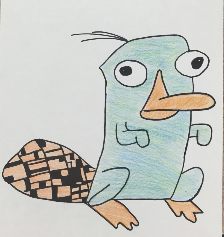 The art movement I had was De Stiji. It was a Dutch art movement from 1917 - 1931. The movement revolved around simple colors and simple geometric shapes. I created a cartoon platypus and integrated the art movement into the tail of the cartoon. The peice of Art was simple and had just a touch of the simple geometric shapes in it. 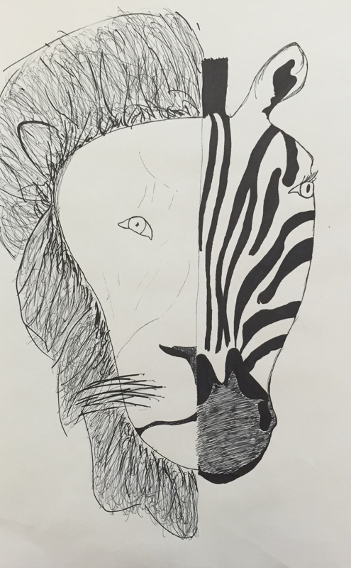 I chose to do half lion half zebra. I thought that the idea of having predator and prey on the same surface would be interesting. The medium I picked to do was sharpie and sharpie pen because it is simple but can be very precise with the details. I was successful at creating the stripes on the zebra, there was an increase in quality from the draft drawing. Something that I could improve on is making the wrinkles/creases in the faces of the animal to make them look more realilistic. 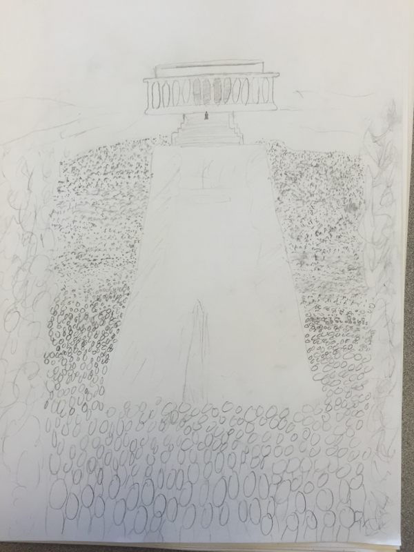 My first peice of artwork is my "people" drawing. It was made for illustration Friday. The hardest part about this peice was figuring how to draw the people that were farther away from the "camera." Once I decided to use dots it took a while because I had to use many of them to represent the 250,000 people who attended the speech of MLK that day. 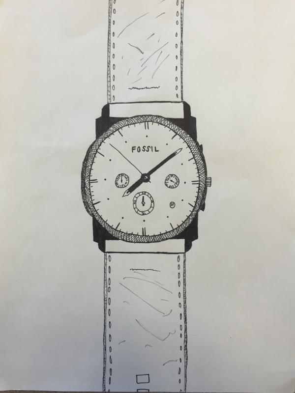 My second peice for the "Pick 2" assignment is a regular drawing whose limitations were that it had to be drawn in either sharpie pen or pencil. I originally wanted to draw a landscape scene but ended up drawing my watch. It was fairly simplistic except for the face of the watch where the numbers and letters had to be placed all correctly. After I am done I am glad I picked doing the watch over a landscape. 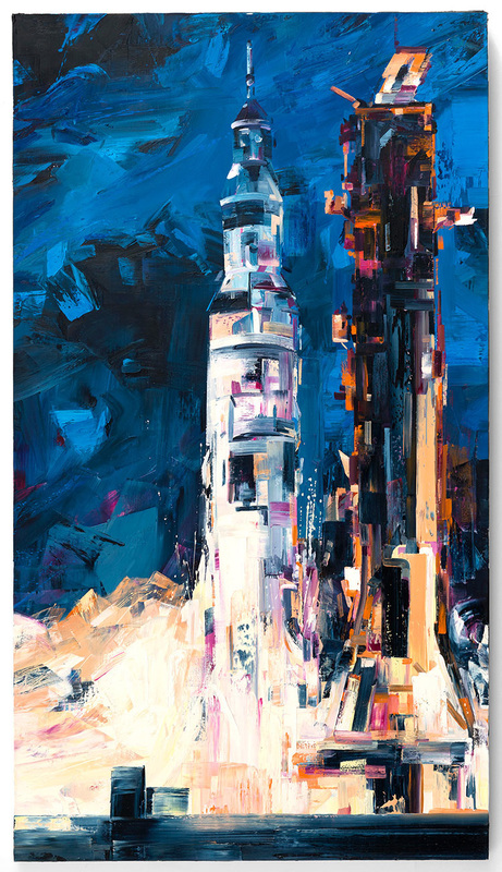 The artist that I found most interesting was Michael Kagan. This man was born in Virginia Beach, VA and now works and is located in Brooklyn, NY. His style is aggressive with large strokes of oil paint on linen. He mainly paints machinery, such as that of space and the road. You can access his Instagram: https://instagram.com/mrkagan and his website to learn more at: http://michaelkagan.com/index.html 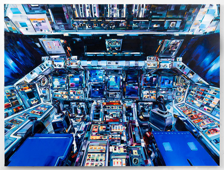 The reason I enjoyed his art is mainly because of his style. He uses boxy large strokes to create larger more complex images. To me his artwork seems very colorful, but at the same time dull. The reason for this is because he uses the same shade of dark blue in all of his paintings, but has brighter colors to contrast the darkness. I also find the topics he paints about interesting. Space travel is fascinating and is crazy
|
AuthorWrite something about yourself. No need to be fancy, just an overview. ArchivesCategories |
 RSS Feed
